SET DE PINCEAUX POUR AQUARELLE ESSENTIELS

MEMORY POINT RONDE -TAILLE 6
Un pinceau polyvalent doté d’une excellente élasticité, qui conserve sa pointe fine pour les grands traits comme pour les détails précis. Il reprend sa forme initiale en toute fiabilité, garantissant précision et contrôle à chaque application.

MEMORY POINT RONDE -TAILLE 1
Parfait pour peindre les détails et les lignes fines. Sa pointe acérée est parfaite pour les travaux délicats, qu’il s’agisse d’ajouter de petites touches ou de créer de fins motifs et textures.
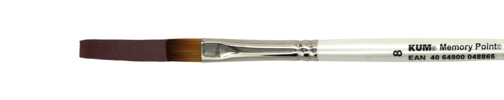
MEMORY POINT PLAT -TAILLE 8
Il est idéal pour les grandes surfaces, les arrière-plans et est indispensable pour les illustrations urbaines. Il permet de réaliser facilement des transitions de couleurs douces.
Essential Watercolor – Your complete guide to watercolor painting
Why Watercolor? The Beauty of This Medium
Watercolor is a unique and captivating painting technique that blends spontaneity with delicate control. Unlike other painting methods, it allows colors to flow, blend, and create stunning effects that are difficult to achieve with other media. The transparency and layering effects make watercolor ideal for capturing light, atmosphere, and organic textures.
What You Will Learn in This Guide
This guide is designed to help you build a strong foundation in watercolor painting. Whether you’re a complete beginner or have some experience, you’ll find step-by-step instructions, essential techniques, and practical exercises to enhance your skills. By the end of this guide, you will:
• Understand how to use different brushes and materials correctly
• Learn key watercolor techniques such as wet-on-wet, glazing, and layering
• Gain control over water, pigment, and blending
• Practice structured exercises to improve your brushwork and color mixing
• Create your first small watercolor artworks with confidence
First Steps: Patience and Practice
Watercolor painting requires a balance of control and letting go. At first, you may feel uncertain about how the paint reacts to water, but with practice, you’ll learn to embrace its fluid nature. The key to success is patience—allow yourself to make mistakes and experiment freely. Unlike opaque painting techniques, watercolor relies on working from light to dark, which means planning ahead and layering gradually.
Tip: Keep a sketchbook dedicated to watercolor exercises. This will help you track your progress and refine your skills over time.
1. Understanding Your Essential Watercolor Brushes
The right tools can make a significant difference in how you paint. Your Essential Watercolor Set includes three carefully selected brushes that will allow you to explore a wide range of techniques:
• Round Brush – Size 6: A versatile all-rounder, perfect for washes, controlled strokes, and fine details when using the tip.
• Round Brush – Size 1: Designed for delicate details, such as thin lines, textures, and precise edges.
• Flat Brush – Size 8: Ideal for larger washes, sharp edges, and structured brushstrokes like bricks or window frames.
Tip: A good brush-holding technique is crucial. Hold your brush near the tip for control or further back for more fluid, expressive strokes. Experiment with different grips to see what works best for you!
Other Essential Materials
Besides brushes, here are some fundamental tools you’ll need for watercolor painting:
1. Watercolor Paper
The paper you use significantly impacts your results. Watercolor paper is specially designed to absorb water and hold pigment without warping. The three main types are:
• Cold-pressed – Slightly textured, great for most styles, from controlled details to loose washes.
• Hot-pressed – Smooth surface, ideal for fine details and pen-and-wash techniques.
• Rough – Strong texture, best for expressive, textured brushwork.
Tip: A paper weight of at least 300gsm (140lb) prevents excessive buckling when wet.
2. Watercolor Paints: Tubes vs. Pans, Artist vs. Student Quality
When it comes to watercolor paints, you can choose between tube or pan format. Both have their advantages, and your preference may depend on your style:
• Tube Paints are more versatile, allowing you to mix large quantities of paint for washes and gradients.
• Pan Paints are more portable and convenient for sketching and travel.
Additionally, it’s important to note the difference between artist-grade and student-grade paints:
• Artist-grade paints are made with pure pigments and have a higher color intensity, lasting power, and transparency.
• Student-grade paints are more affordable but may have fillers that affect the richness and quality of the color.
3. Water & Mixing Palette
Always have two jars of clean water: one for rinsing your brush and one for mixing fresh colors. A ceramic or plastic mixing palette helps you test colors before applying them to paper.
4. Additional Tools
• Pencil (HB or 2B) – For light sketches before painting.
• Kneaded Eraser – Gentle on watercolor paper, ideal for lifting pencil marks.
• Paper Towels or Tissues – To absorb excess water or correct mistakes.
• Masking Tape – To create clean edges or protect areas of your painting.
2. Basic Watercolor Techniques
Mastering a few key techniques will allow you to create a wide range of effects and bring depth to your paintings. Here are the fundamental techniques to start with:

Wet-on-Wet Technique: Soft Transitions and Atmospheric Effects
This technique involves applying wet paint to wet paper, allowing the colors to flow and blend together. It’s ideal for creating soft backgrounds, skies, and atmospheric effects. To use this technique:
1. Wet your paper with clean water using a large flat brush.
2. Apply the watercolor to the wet paper and let the pigment naturally spread and merge.

Wet-on-Dry Technique: Precise Shapes and Color Control
In contrast to wet-on-wet, the wet-on-dry technique involves applying wet paint onto dry paper. This allows for more control and precise shapes, making it perfect for creating detailed areas of a painting such as flowers, buildings, or fine lines.
• Pro Tip: This technique works best with a smaller brush and a controlled amount of water to maintain crisp, clean lines.
Glazing: Layering for Depth and Richness
Glazing is the process of layering transparent washes of color on top of dry layers. This builds depth and creates more complex colors. To glaze:
1. Apply a thin wash of color to the dry painting.
2. Allow it to dry before applying additional layers.

Granulating & Dry Brush Techniques: Texture and Detail
Granulation occurs when pigments in watercolor form textured patterns as they dry. This effect can be used to create interesting textures like rocks or rough surfaces.
• Dry Brush Technique: Use a relatively dry brush with minimal water to create rough, scratchy strokes that add texture and detail, perfect for foliage or textured objects.
3. Layering & Depth in Watercolor
Watercolor painting is unique in its ability to create depth and dimension through layering. Since watercolor is transparent, layering colors allows for beautiful depth, gradual shading, and rich details without overworking the paper.
The Importance of Drying Time
When layering colors, it’s essential to let each layer dry completely before applying the next. If the previous layer is still wet, the new color will blend into it, creating soft transitions instead of defined layers.
• Wet-on-Dry Technique: Applying paint on a dry layer creates crisp, controlled shapes.
• Wet-on-Wet Technique: Applying paint on a still-wet layer results in soft blends and organic transitions.
A good rule of thumb: If you want sharp details and defined layers, wait for the previous wash to dry. If you want smooth color transitions, work while the paint is still wet.
From Light to Dark: The Golden Rule
Unlike opaque painting mediums like acrylic or oil, watercolor requires you to work from light to dark. Once a dark color is applied, it’s difficult to make it lighter again.
How to Build Depth with Layers:
1. First Layer (Light Washes): Begin with a diluted color to establish the lightest areas.
2. Second Layer (Midtones): Add slightly darker tones to shape forms and add dimension.
3. Third Layer (Shadows & Details): Use deeper colors to define contrast and make the painting pop.
Patience is key—rushing the layers can result in muddy colors or unwanted blending.
Glazing Technique for Rich Colors
Glazing is a layering technique where thin, transparent layers of color are built up gradually. It allows the colors underneath to shine through, creating luminosity and richness.
• Step 1: Paint a light, transparent wash of color. Let it dry completely.
• Step 2: Apply another transparent layer over it, adjusting the hue or intensity.
• Step 3: Repeat as needed, ensuring each layer is dry before adding the next.
This technique is useful for creating shadows, smooth gradients, and subtle color shifts in your artwork.
Negative Painting for Advanced Depth
Negative painting is a technique where you paint around a shape rather than filling it in. This helps create depth and contrast while keeping highlights intact.
How to Try Negative Painting:
1. Paint a light background wash.
2. Once dry, add a darker layer around the subject, leaving parts of the first layer visible.
3. Repeat with even darker tones, creating multiple layers of depth.
This technique is perfect for creating realistic foliage, abstract textures, and intricate details.
Practice Exercise: Layering with a Simple Shape
To practice layering, try this exercise:
1. Draw a simple leaf or sphere.
2. Start with a very light wash of color.
3. Once dry, add another layer, darkening only certain areas to create volume.
4. Repeat with additional layers to create depth and shadow.
By mastering layering, you can achieve a sense of realism and vibrancy in your watercolor paintings.
4.Color Mixing & Understanding Pigments
Understanding how to mix colors and how different pigments behave on paper is essential in watercolor painting. Unlike other painting mediums, watercolors are transparent, meaning that layering and mixing are key to achieving the desired depth and richness in your artwork.
The Basics of Color Mixing
Watercolors rely on the three primary colors—red, blue, and yellow—to create almost any shade. By mixing these, you can create secondary and tertiary colors.
• Primary Colors: Red, Blue, Yellow
• Secondary Colors: Orange (Red + Yellow), Green (Blue + Yellow), Purple (Red + Blue)
• Tertiary Colors: Made by mixing a primary color with a secondary color (e.g., Red-Orange, Blue-Green)
When mixing colors, always start with lighter colors and gradually add darker pigments. Mixing too many colors together can result in muddy tones, so keep it simple and experiment with small amounts at first.
Warm and Cool Colors
Colors have temperature:
• Warm Colors: Reds, Oranges, and Yellows create a sense of energy and warmth.
• Cool Colors: Blues, Greens, and Purples give a calming and soothing effect.
Understanding this distinction helps in creating mood and contrast in your paintings.
Transparency and Opacity
Each watercolor pigment behaves differently. Some colors are very transparent, while others are more opaque. Transparency allows for layering techniques, while opaque colors can be used for strong details.
To test your paints:
1. Paint a black ink line on paper.
2. Apply a wash of color over it.
3. If the line is clearly visible through the color, the pigment is transparent. If it gets covered, the pigment is opaque.
The Magic of Water Control
The amount of water on your brush dramatically affects how your colors behave:
• More Water: Lighter, more transparent washes. Great for backgrounds and layering.
• Less Water: Stronger, more pigmented colors. Perfect for details and defining edges.
Practicing water control will help you achieve the perfect balance in your paintings.
Creating a Color Chart
A great exercise for beginners is to create a color chart with the paints in your set. Simply make a grid and mix your colors systematically to see how they interact. This will give you a reference for future paintings and help you understand the full potential of your palette.
5. Control Over Water & Color
How much water is too much or too little?
Control over water is crucial in watercolor painting. Too much water can lead to blurry colors and uncontrollable flows, while too little water can make the colors appear dry and patchy. The key is finding the right balance.
• Pro Tip: If you feel that your brush has too much water, gently dab it on a towel to regulate the amount.
The Right Ratio of Pigment to Water
The ratio of pigment to water determines the intensity of your color. For vibrant, bold colors, use less water, and for softer, transparent tones, use more water.
• Pro Tip: Test the ratio on a scrap piece of paper to see how the color changes with different levels of dilution. This will give you a better sense of the desired effect.
Avoiding Mistakes: Too Much Water, Bloom Effects & Ugly Edges
Too much water can lead to unwanted “bloom effects,” where the colors spread uncontrollably. Another common issue is creating harsh edges when the colors don’t blend smoothly.
• Pro Tip: Pay attention to the amount of water you’re using and check your brush regularly. If you notice hard edges forming, you can gently run a damp brush over the edges to soften the transitions.
6. Brush Techniques & Control
Understanding how to control your brush is one of the most important skills in watercolor painting. The way you hold your brush, the amount of pressure you apply, and the amount of water on your brush all influence the outcome of your strokes.
Holding the Brush
The way you hold your brush affects the fluidity and precision of your strokes. Here are some common grips and their effects:
• Near the Ferrule (Metal Part): Gives you more control for fine details and precise lines.
• Middle of the Handle: A balanced grip, good for general painting and soft strokes.
• Near the End of the Handle: Creates loose, expressive strokes with more movement.
Experiment with different grips to find what feels most natural for each type of stroke.
Basic Brush Strokes
Each brush in your Essential Watercolor Set—the two round brushes (sizes 6 and 1) and the flat brush (size 8)—serves a different purpose.
Using Round Brushes (Size 6 & 1)
• Thin Lines: Use the tip of the brush with light pressure. Great for details, outlines, and delicate textures.
• Thick Strokes: Press the brush down for broader strokes. Works well for leaves, petals, and organic shapes.
• Tapered Strokes: Start with firm pressure and lift gradually to create a fading effect.
• Dry Brush Effect: Use minimal water for textured, broken strokes.
Using the Flat Brush (Size 8)
• Broad Washes: Load the brush with water and pigment to create smooth, even backgrounds.
• Sharp Edges: The flat shape allows for precise architectural lines and geometric forms.
• Side Strokes: Hold the brush at an angle to create thin, parallel lines—great for wood textures, grass, or subtle shading.
Brush Control Exercises
Practicing brush control will help you develop confidence and precision. Here are a few exercises to try:
Exercise 1: Line Variations
• Use the round brush (size 6) and practice making thick-to-thin strokes.
• Experiment with different pressures to create variation in line weight.
Exercise 2: Gradient Strokes
• Load the brush with paint and apply a strong stroke.
• Dip the brush in clean water and drag the color down, creating a smooth gradient.
Exercise 3: Dry Brush Textures
• Dab excess water off your brush and use quick, light strokes to create a rough, grainy effect.
• Try this on textured paper to see how the pigment catches on the surface.
Mastering these brush techniques will give you better control over your painting and open up new creative possibilities.
7. Exercises for Beginners
Simple Brush Exercises: Strokes, Dots, Circles, Controlled Lines
Start with simple exercises to get a feel for your brush and how it picks up color. Practice making straight lines, soft curves, and small dots. These basic exercises will help you gain control over your painting technique.
• Pro Tip: Experiment with varying pressure to see how the brush responds when you apply more or less pressure.
Practicing Water & Color Control: Gradients, Glazing, Layering Techniques
To improve your control over water and color, practice gradients, where the color transitions gently from light to dark. Also, glazing and layering techniques are great exercises to develop better control.
• Pro Tip: Be sure that the first layer is completely dry before applying the next to preserve the clarity of the colors.
Texture Exercises: Painting Brickwork, Clouds, Trees with Different Techniques
Painting textures like brickwork, trees, or clouds is an excellent way to combine different techniques and improve your ability to create depth and variety in your work.
• Pro Tip: Use the dry brush technique for creating rough edges and textures when painting brickwork. For clouds, work with wet-in-wet to create soft, diffused transitions.
Understanding Color Mixing: Complementary Colors, Color Wheel & Warm/Cool Colors
Learn how colors interact by using the color wheel. Pay attention to how complementary colors (colors opposite each other on the color wheel) work together to create contrast.
• Pro Tip: Use warm colors (red, yellow, orange) for lively, energetic subjects, and cool colors (blue, green, violet) for peaceful, calming scenes.
8. First Small Projects
Sky & Landscapes: Simple Skies and Water Areas with Gradients
Start with simple landscapes by first painting the sky. Watercolor is perfect for soft transitions from blue to white and for painting water surfaces with gradient washes.
• Pro Tip: When painting clouds, use the wet-in-wet technique to achieve soft, diffuse transitions.
Floral Motifs: Leaves, Flowers, and Simple Plants
Floral subjects like leaves and flowers are not only beautiful but also ideal for developing a sense of color and form. Start with simple plants and experiment with different techniques like wet-on-dry for details and wet-in-wet for the background.
• Pro Tip: The glazing technique works well for painting leaves as it allows you to build up shadows and highlights gradually.
Urban Watercolor Basics: Buildings, Windows, and Small City Scenes
To start with Urban Watercolor, it’s helpful to begin with simple buildings and windows. Draw the outlines first and then gradually add details like windows, rooftops, and streets.
• Pro Tip: Combine wet-in-wet for the sky and background with wet-on-dry for precise building outlines and details.
Creative Freestyle Techniques: Watercolor with Salt, Splattering, Masking Fluid
Try out creative watercolor techniques like using salt to create textures or splattering for random effects. Masking fluid can be used to protect specific areas and maintain highlights.
• Pro Tip: Experiment with masking fluid for fine lines or reflective surfaces like water or shiny leaves.
9. From Sketching to the Finished Artwork
How to Transfer a Template to Watercolor Paper?
Transferring a design or template onto watercolor paper is a simple yet essential skill. Here’s how to do it:
1. Download and Print the Template: First, download and print your template.
2. Prepare the Template: Flip the printed template over, and lightly shade the backside with a soft pencil (preferably 2B or 4B). This creates a carbon-like transfer surface.
3. Place the Template on Your Watercolor Paper: Position the template where you want it on your watercolor paper.
4. Transfer the Outline: Using a sharp pencil or fine-tipped pen, trace the outlines of the template. The pressure should be light enough not to damage the watercolor paper but firm enough to transfer the image clearly.
• Pro Tip: Make sure the pencil marks are light to avoid harsh lines that might interfere with the watercolor later on.
Freehand vs. Template: Sketching for Watercolor
While using templates is a great way to start, learning to sketch freehand is an important skill to develop. Start by practicing simple shapes and outlines without relying on templates. This builds your confidence and helps with creating personalized compositions.
• Pro Tip: Practice sketching simple objects like flowers, leaves, or geometric shapes to build up your freehand drawing skills.
The Right Order: Work from Light to Dark
In watercolor painting, it’s essential to work from light to dark, as this allows you to build up layers gradually without losing the lightness and transparency of the colors.
• Pro Tip: Start by painting the lightest areas of your subject with a diluted wash of color and then gradually move towards the darker shades with more pigment. This helps maintain the depth and luminosity of the painting.
Patience: Waiting for Drying Phases
Patience is key in watercolor. Since watercolor relies heavily on the interaction of water and pigment, it’s crucial to wait for each layer to dry before proceeding to avoid unwanted bleeding of colors.
• Pro Tip: If you’re pressed for time, use a hairdryer on a low setting to speed up the drying process. But be careful not to overheat the paper, as this can cause damage.
10. Inspiration & Further Development
How to Develop Your Own Style?
Developing your own artistic style takes time and experimentation. The best way to discover what resonates with you is by practicing various techniques, exploring different subjects, and observing your preferences as you go.
• Pro Tip: Try different subjects like florals, landscapes, and urban scenes. Over time, you will notice which types of subjects or techniques feel most natural to you. This is the foundation of your style.
Artists & Inspirations: Where to Learn and Grow
There’s an abundance of inspiring artists out there. Follow artists whose work resonates with you and who inspire you to try new things. You can find inspiration not only in their finished pieces but also in their creative processes.
• Pro Tip: Check out online platforms like Instagram, Pinterest, or YouTube for tutorials, challenges, and inspiration from fellow watercolor enthusiasts.
Useful Online Resources & Books
To continue improving your skills, seek out additional resources such as books, online tutorials, and classes. These can offer deeper insights into techniques and give you a broader understanding of watercolor painting.
• Pro Tip: Look for books that offer step-by-step instructions or guide you through various projects.
Use templates:


